The easiest mistake in private wellness shopping is starting with a product name.
Names can be vague. Photos can be uneven. Prices can distract. A better comparison starts with the format: what the item is built to do, how much space it needs, how it should be cared for, and how private the order path feels before checkout.
That is where broader retail trends are moving. NIQ’s 2026 health and wellness analysis describes a more self-directed shopper who evaluates products by attributes, fit, and expected outcomes rather than brand names alone. Baymard’s 2026 product-page UX research makes a similar point from the ecommerce side: weak product-page information causes shoppers to abandon otherwise suitable products.
For private wellness, those ideas matter more than usual. The customer is not only comparing a shape or a price. They are judging clarity, discretion, storage, packaging, care instructions, and whether the store can answer practical questions without making the purchase feel exposed.
Start With The Format, Not The Product Name
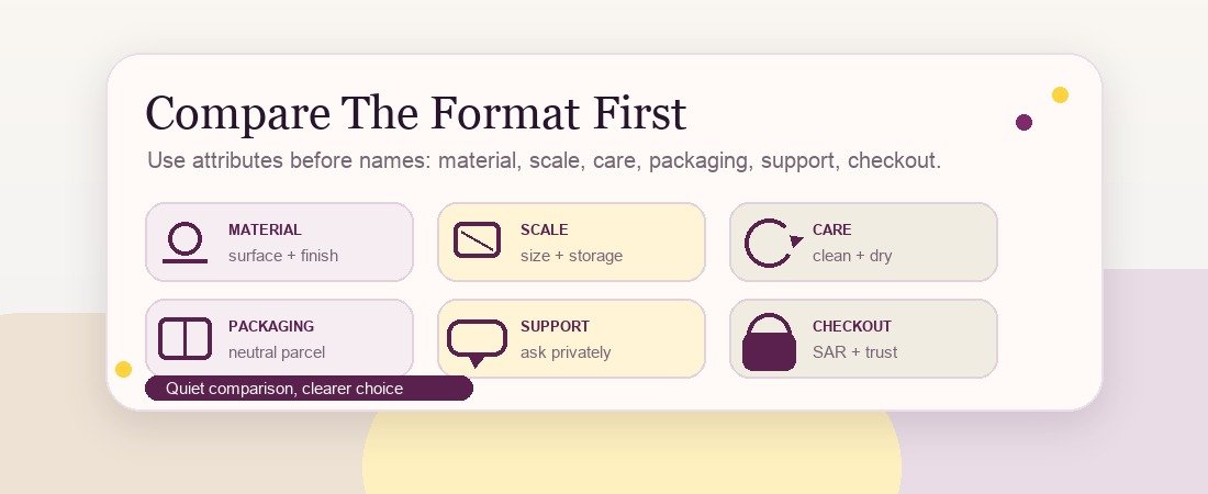
A format is the product’s practical role.
On Laylati, the main browsing groups include realistic forms, torso series, pumps and accessories, and starter sets. Each group should be compared differently.
Realistic forms are usually evaluated by material, finish, size, weight, and care needs. Torso series items require more attention to scale, storage, cleaning space, and parcel handling. Pumps and accessories should be judged by compatibility, included parts, maintenance, and replacement needs. Starter sets should be judged by whether the bundle removes confusion or simply adds extra pieces.
The point is not to make the category sound more complicated. It is to prevent the wrong comparison.
A compact item and a large-format item should not be judged only by price. A single item and a bundle should not be judged only by item count. A category with accessories should not be judged without checking what is included and what needs to be purchased separately.
Use A Six-Part Comparison
Before ordering, compare each category through six simple questions.
First: material. Is the material clearly stated, and does the page explain basic care expectations? A shopper should not need to guess whether the surface is soft-touch, silicone-like, hard plastic, or mixed material.
Second: scale. Are dimensions and weight easy to understand? For private wellness, scale affects storage, handling, delivery expectations, and whether the item fits the buyer’s practical situation.
Third: care. Does the page explain cleaning, drying, and storage basics in plain language? Laylati’s guide to private wellness product care covers the general habit: clean promptly, dry fully, and store items away from heat, dust, and direct contact with incompatible materials.
Fourth: packaging. Does the store explain neutral parcel handling and order privacy before checkout? The discreet packaging page should be easy to find from the shopping path.
Fifth: support. Can you ask a practical pre-purchase question without giving unnecessary personal details? Laylati’s guide to private support before ordering explains why a serious store should answer product, packaging, delivery, and billing questions without collecting more information than needed.
Sixth: checkout confidence. Checkout.com’s 2026 Saudi payments analysis shows how important payment security and trust have become in Saudi ecommerce. A clear product comparison still needs a calm checkout path, readable SAR totals, and sensible order communication.
How To Read Category Pages More Carefully
A useful category page should help a shopper narrow choices without forcing a private conversation too early.
For realistic forms, compare finish, dimensions, care notes, and whether the product photo is clear enough to understand the shape and surface. If two items look similar, the deciding factor may be size, texture, or ease of storage rather than the name.
For torso series, scale matters first. Large-format items need better photos, clearer measurements, and more careful delivery expectations. A product page should make the buyer feel prepared, not surprised.
For pumps and accessories, the most important question is compatibility. What is included? What is optional? What needs replacement or extra care? Accessories should reduce friction, not create a second guessing game.
For starter sets, look for clarity. A good starter set gives a new buyer a simple path. A weak set only groups unrelated items under a discount label.
Photos Should Clarify, Not Decorate
Product photography is not cosmetic in this category. It is part of trust.
Baymard’s product-page research notes that weak product-page UX can make shoppers abandon suitable products because the page fails to support the decision. In private wellness, image quality is one of the first places that failure appears.
A good product image should show the item clearly, keep the background clean, avoid confusing scale, and support the written measurements. If a product needs a detail view, show it. If the item is large, the page should not hide that fact with a tight crop. If a bundle contains multiple parts, the photo should make the included pieces obvious.
This is also where Laylati still has room to improve. Some current product photos are useful for basic identification, but not yet at a polished retail standard. Better crops, cleaner backgrounds, and clearer detail shots would make comparison easier and reduce support questions.
Private Does Not Mean Vague
Some stores confuse discretion with vagueness. That is a mistake.
Private shopping still needs concrete information. The copy can stay calm and non-explicit while giving the buyer enough detail to choose responsibly. Dimensions, materials, included parts, care notes, delivery expectations, and support boundaries are not sensitive content. They are basic retail information.
DHL’s 2026 ecommerce work describes a widening gap between what shoppers expect and what some retailers deliver. For Laylati, closing that gap means being more useful, not louder. Better product structure, clearer category pages, and more neutral buying guides help the shopper make a private decision without feeling pushed.
A Simple Comparison Checklist
Before choosing a private wellness product format, ask:
- Do I understand the material and surface?
- Are the size and weight clear enough for storage and handling?
- Does the page explain cleaning, drying, and storage basics?
- Do the photos clarify the product rather than hide important details?
- Is the parcel and order communication explained before checkout?
- Can support answer practical questions without asking for unnecessary personal information?
- Does the category page help me compare, or does it only show a grid of products?
- If this is a set, does the bundle actually simplify the first order?
If several answers are unclear, do not rush the purchase. Ask support, compare another format, or read the category guidance again.
The Laylati Standard
Laylati should make format comparison quiet, specific, and practical.
That means each category needs clearer product data, cleaner photography, better size context, and links to care, packaging, billing, and support guidance. It also means avoiding exaggerated claims. The shopper does not need dramatic language. They need enough information to choose the right format privately.
The next improvement is structural: turn the current static catalog into stronger category education, then eventually into real WooCommerce product data with proper attributes, stock, schema, checkout, and order handling. Until then, every buying guide should reduce confusion and raise trust.
Sources reviewed
- NIQ, `Health and Wellness Consumer Trends 2026: The rise of the self-directed Health & Wellness consumer`, published 2026
- Baymard Institute, `Product Page UX 2026: 10 Pitfalls and Best Practices`, updated March 18, 2026
- Checkout.com, `Mastering payments in Saudi Arabia's digital economy`, published June 19, 2026
- DHL Group, `DHL E-Commerce Trends Report 2026: Old rules don't apply in the age of AI`, published June 2, 2026
- DHL, `What online shoppers want that retailers still miss`, 2026
Before choosing a format, compare the category pages and ask Laylati support practical questions about material, scale, packaging, care, and delivery. A discreet order should start with clear information.